

Excess rentals in TfL bike sharing
We can get the latest data of London bike sharing by running the following code.
url <- "https://data.london.gov.uk/download/number-bicycle-hires/ac29363e-e0cb-47cc-a97a-e216d900a6b0/tfl-daily-cycle-hires.xlsx"

# Download TFL data to temporary file
httr::GET(url, write_disk(bike.temp <- tempfile(fileext = ".xlsx")))
## Response [https://airdrive-secure.s3-eu-west-1.amazonaws.com/london/dataset/number-bicycle-hires/2021-08-23T14%3A32%3A29/tfl-daily-cycle-hires.xlsx?X-Amz-Algorithm=AWS4-HMAC-SHA256&X-Amz-Credential=AKIAJJDIMAIVZJDICKHA%2F20210921%2Feu-west-1%2Fs3%2Faws4_request&X-Amz-Date=20210921T215450Z&X-Amz-Expires=300&X-Amz-Signature=2b80ee4a8da66b10fc5b27a58ad33b801790273e5113d0f1b19c6028ceb45b4e&X-Amz-SignedHeaders=host]
## Date: 2021-09-21 21:54
## Status: 200
## Content-Type: application/vnd.openxmlformats-officedocument.spreadsheetml.sheet
## Size: 173 kB
## <ON DISK> C:\Users\RoryYu\AppData\Local\Temp\RtmpMVjOmg\file57ac67d641ec.xlsx# Use read_excel to read it as dataframe
bike0 <- read_excel(bike.temp,
sheet = "Data",
range = cell_cols("A:B"))
# change dates to get year, month, and week
bike <- bike0 %>%
clean_names() %>%
rename (bikes_hired = number_of_bicycle_hires) %>%
mutate (year = year(day),
month = lubridate::month(day, label = TRUE),
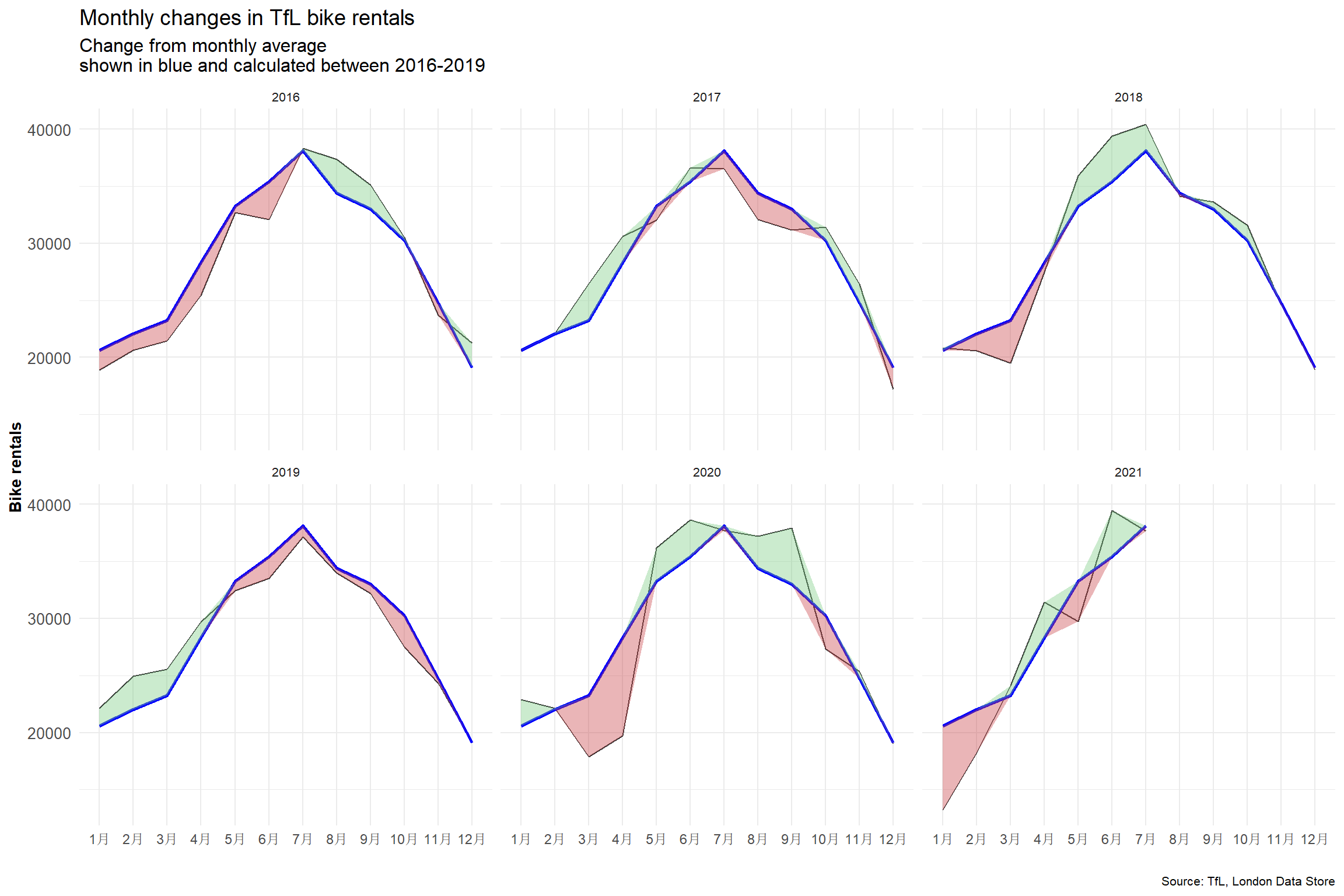
week = isoweek(day))Look at May and Jun and compare 2020 with the previous years. The curves are flattening in May and June 2020 compared to previous years, implying less bikes are being rented per day. In early 2020 Covid-19 hit the world and the first wave of infections arrived around April and May 2020. People were put in an unprecedented situation with living through a pandemic. Many people were afraid to go out, in fear of catching the virus, the consequences of which have not yet been fully researched.
In a world where people are generally afraid of going out, it is likely that people also don’t want to rent public bikes which have been used by numerous individuals that could potentially carry the virus. Consequently, bike rentals in May and June went down with people trying to touch as little as possible things to reduce the likelihood of catching the virus.
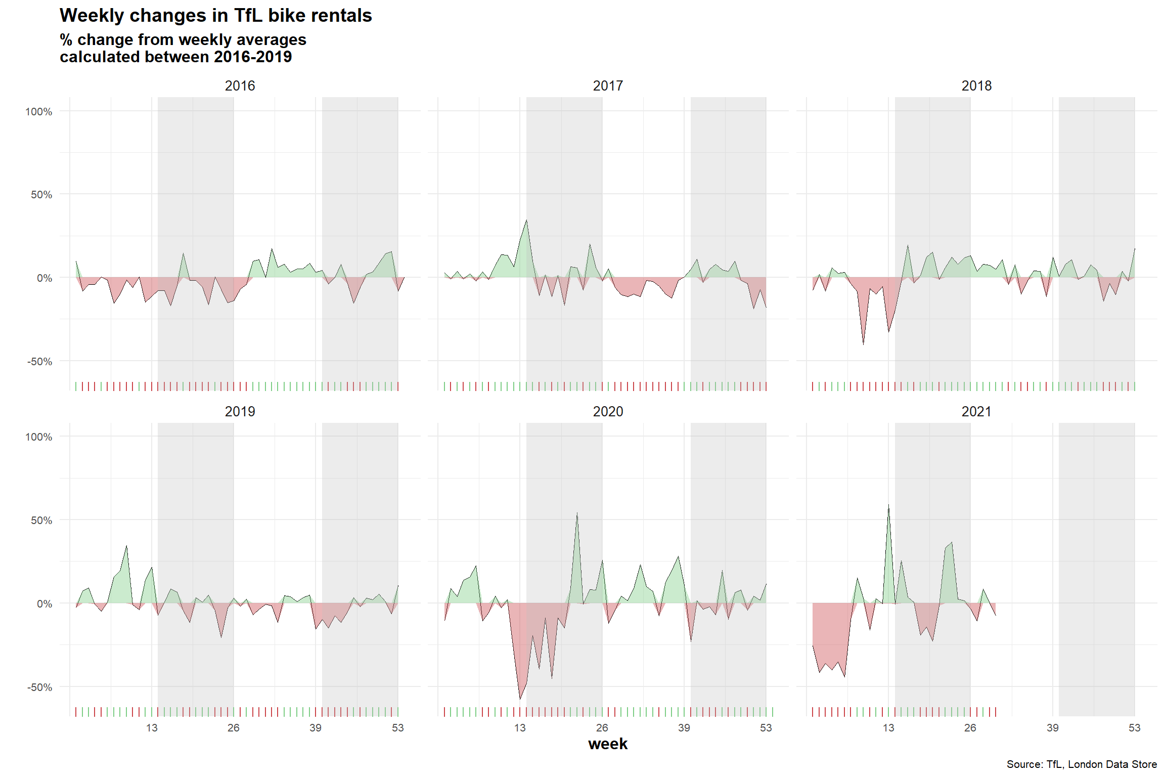
For both of these graphs, we have to calculate the expected number of rentals per week or month between 2016-2019 and then, see how each week/month of 2020-2021 compares to the expected rentals. Think of the calculation excess_rentals = actual_rentals - expected_rentals.
#Compute expected average bike rentals in each month
exp_bikes_per_month <- bike %>%
  filter(year %in% 2016:2019) %>%
  group_by(month) %>%
  summarize(
    monthly_average = mean(bikes_hired)
  )
#Compute actual average bike rentals per month
actual_bikes_per_month <- bike %>%
  filter(year>=2016) %>%
  group_by(year, month) %>%
  summarize(
    act_monthly_average = mean(bikes_hired)
  )
#Merge actual and expected bike rental in one dataframe
bikes_per_month <-
  left_join(actual_bikes_per_month, exp_bikes_per_month, by="month")

#Compute discrepancies in actual and expected bike rentals
bikes_per_month <- bikes_per_month %>%
  mutate(
    excess_rentals = act_monthly_average - monthly_average,
    up = ifelse(act_monthly_average>monthly_average, excess_rentals, 0),
    down = ifelse(act_monthly_average<monthly_average, excess_rentals, 0)
  )

ggplot(bikes_per_month, aes(x=month, group = year))+
  geom_line(aes(y=act_monthly_average),size=0.4, color="#333333")+
  geom_line(aes(y=monthly_average), size=1, color="blue") +
  facet_wrap(~year)+
  theme_minimal()+
  geom_ribbon(aes(ymin=monthly_average,ymax=monthly_average+up),
              fill="#7DCD85",alpha=0.4)+
  geom_ribbon(aes(ymin=monthly_average+down,ymax=monthly_average),
              fill="#CB454A",alpha=0.4)+
  labs(
    title="Monthly changes in TfL bike rentals",
    subtitle="Change from monthly average
shown in blue and calculated between 2016-2019",
    y="Bike rentals",
    x="",
    caption = "Source: TfL, London Data Store"
  )+
  theme(plot.title = element_text(size=14),
        plot.subtitle=element_text(size = 12),
        axis.title.y = element_text(face="bold", size=10),
        axis.text.x = element_text(size=9),
        axis.text.y = element_text(size=10),
        plot.caption = element_text(size=8),
        strip.text = element_text(size=8)
        )
#Compute expected weekly average bike rentals in each month
exp_bikes_per_week <- bike %>%
  filter(year>=2016 & year <=2019) %>%
  group_by(week) %>%
  summarize(
    weekly_average = mean(bikes_hired)
  )

#Compute actual average bike rentals per week
actual_bikes_per_week <- bike %>%
  filter(year>=2016) %>%
  group_by(week,year) %>%
  summarize(
    act_weekly_average = mean(bikes_hired)
  )
#Merge actual and expected bike rental in one dataframe
bikes_per_week <-
  left_join(actual_bikes_per_week, exp_bikes_per_week, by="week")

#Compute discrepancies in actual and expected bike rentals. In addition,
#take out week 53 for 2021.
bikes_per_week <- bikes_per_week %>%
  filter(!(week==53 & year==2021)) %>%
  mutate(
    excess_rentals = (act_weekly_average - weekly_average) / weekly_average,
    up = if_else(excess_rentals>0, excess_rentals,0),
    down = if_else(excess_rentals < 0, excess_rentals,0)
  )
#Plot graph
ggplot(bikes_per_week,aes(x=week))+
         geom_line(aes(y=excess_rentals), size=0.2)+
  facet_wrap(~year)+
  theme_minimal()+
  geom_ribbon(aes(ymin=down,ymax=0),
              fill="#CB454A",
              alpha=0.4)+
  geom_ribbon(aes(ymin=0, ymax=up),
              fill="#7DCD85",
              alpha=0.4)+
  geom_rug(data=subset(bikes_per_week, excess_rentals > 0),
           sides="b",
           color="#7DCD85")+
  geom_rug(data=subset(bikes_per_week, excess_rentals < 0),
           sides="b",
           color="#CB454A")+
  annotate(geom = "rect", xmin = 14, xmax = 26, ymin = -Inf, ymax = Inf, fill = "grey", alpha=0.3)+
  annotate(geom = "rect", xmin = 40, xmax = 52, ymin = -Inf, ymax = Inf, fill = "grey", alpha=0.3)+
  scale_y_continuous(breaks=seq(-0.5,1,0.5),labels=function(x) paste0(x*100, "%"),limits=c(-0.6,1))+
  scale_x_continuous(breaks=seq(0,53,13),labels=c("","13", "26", "39", "53"))+
  labs(
    title="Weekly changes in TfL bike rentals",
    subtitle="% change from weekly averages
calculated between 2016-2019",
    y="",
    x="week",
    caption = "Source: TfL, London Data Store"
)+
  theme(plot.title = element_text(size=14, face="bold"),
        plot.subtitle=element_text(size = 12, face="bold"),
        axis.title.x = element_text(face="bold", size=12),
        axis.text.x = element_text(size=8),
        axis.text.y = element_text(size=8),
        plot.caption = element_text(size=8),
        strip.text = element_text(size=10)
        )
Generally speaking, expected values are computed by using the mean. The mean takes into account all values, even outliers, and therefore provides a good estimation of future values. The median also takes into account all values, but chooses the middle value, which might not accurately present future data.
Just in very skewed distributions, it might make sense to use the median to prevent outliers from skewing data, but I believe in this case the mean should be the most precise metrics. Furthermore, those two graphs were using the average, we used the same in order to properly replicate the graph.