

Brexit plot
we use the Brexit results dataframe and produce the following plot.
brexit_data <- read_csv(here::here("data","brexit_results.csv"))

party_proportion <- brexit_data %>%
  pivot_longer(cols = 2:5,
               names_to = "party",
               values_to = "percentage")

ggplot(party_proportion, aes(x = percentage,
                        y = leave_share,
                        group = party,
                        fill = party,
                        color = party))+
  geom_point(shape = 21,
             alpha = 0.3)+
  geom_smooth(method = "lm",
              formula = y ~ x,
              fill = "#A9A9A9")+
  labs(title = "How political affiliation translated to Brexit Voting",
       subtitle = "",
       x = "Party % in the UK 2015 general election",
       y = "Leave % in the 2016 Brexit Referendum")+
  theme_bw()+
  theme(legend.position = "bottom")+
  scale_shape_manual(values = 21) +
  scale_color_manual(values = c("con_2015" = "#0087DC",
                                "lab_2015" = "#E4003B",
                                "ld_2015" = "#FAA61A",
                                "ukip_2015" = "#FFFF00"),
                     name = "",
                     labels = c("Conservative", "Labour", "Lib Dems", "UKIP"))+
  scale_fill_manual(values = c("con_2015" = "#0087DC",
                                "lab_2015" = "#E4003B",
                                "ld_2015" = "#FAA61A",
                                "ukip_2015" = "#FFFF00"),
                    name = "",
                    labels = c("Conservative", "Labour", "Lib Dems", "UKIP"))+
  coord_cartesian(xlim=c(0,80), ylim=c(20,100)) #to get smooth line fully covered by confidence band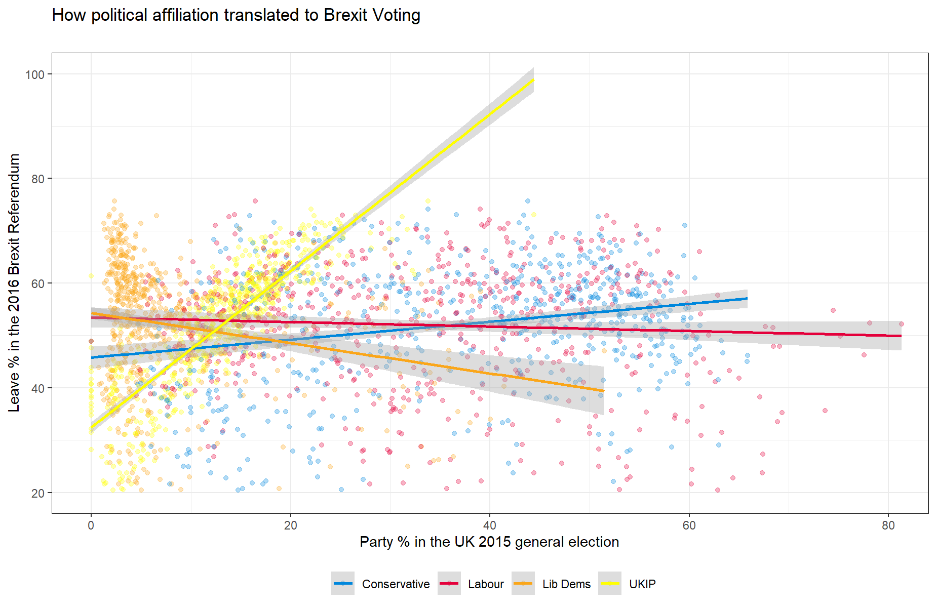
ylim(20, 100)## <ScaleContinuousPosition>
## Range:
## Limits: 20 -- 100